IN THIS SECTION
Overview
Charts are a core building block of Dashboards, and Report Packs in Joiin. Managing charts allows you to control how data is displayed, reused, and kept consistent across your reporting. This article explains how chart management works in Joiin and how to make changes confidently without unintentionally affecting other reports.
Using charts in Joiin, you can:
• Display financial, sales and purchasing, budgets and forecasts, eliminations, and non-financial data
• Build charts using both built-in and custom KPIs to summarise complex information clearly
• Choose from a range of chart types to suit different reporting needs
• Customise chart presentation, including axes, grid lines, and other display options
• See where charts are used across reports, dashboards, and report packs
Adding Chart Widgets
When you choose to add a chart/widget, either from a Dashboard or from a Report Pack, you will first be presented with a list of out-of-the-box widgets. These are based off the metrics which appear in the standard KPI report and include things like Revenue vs Budget, Expenses, Activity Ratio etc. They are grouped into tabs and you can search for a widget by entering text in the search box.
If you have added a Stripe Connection you will also see additional widgets under the SaaS tab.
Customised charts can be created by selecting the Custom KPI item and from there configuring the chart as required - see below.
The Chart Widgets
Each widget on the Dashboard/Report Pack shows a particular metric in a chart. You can select from the following types of chart:
 | Value only Display Displays the data values for the whole period for each selected KPI. Includes a comparison percentage if you have chosen to include a compare option. |
 | Line Chart Displays data for each month of the selected period in a line chart. A second line will be shown if you have selected a second KPI or a compare option. |
 | Bar Chart Displays data for each month of the selected period in a bar chart. A second bar will be shown if you have selected a second KPI or a compare option. |
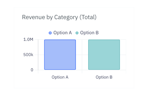 | Bar Chart (Total) Available if you have selected multiple series or by Category option. Displays data for each series, totalled across the whole period. |
 | Doughnut Chart Displays data for whole period for each selected KPI - or for a single KPI and the compare period/budget - in a doughnut chart. Only available if you have selected a multiple KPIs or a compare option. |
Understanding information on a Chart
Each chart shows a variety of information. You can choose what information is displayed in the Widget configuration - see below. By hovering over the chart you can reveal more information. This section explains more, using the line chart as an example.

- The period range is shown along the x-axes.
- Each point represents data for a single month.
- The blue figure at the top left is the total value over the whole period.
- The smaller grey figure at the top right is the total value over the whole of the comparison period.
- The red or green percentage figure is how much the total value has changed between the two overall figures.
You can move your mouse over the graph to highlight individual points as below.

When you highlight a point:
- A popup appears showing the values for that specific month.
- The blue figure at the top left changes to show the value for that particular month
- The grey figure at the top right changes to show the value for the comparison month
- The red or green percentage changes to show the percentage change between the two values
Editing Chart Widgets
You can change what a widget shows by clicking on the configure icon at the top right of the widget frame.

This brings up the widget configuration where you can configure how your widget behaves.
Companies and Groups
To choose which companies or groups you want to show data for, click on the Companies link at the top and select the companies you wish to view. You can see which companies you have currently selected by hovering over the companies link.
TIP: If you're regularly adding and removing companies from Joiin or if you have common sets of companies you report on it can be useful to configure your Dashboard using Groups. By adding all the companies you want to see on your dashboard to a Group your dashboard will always reflect the companies you wish. Read more about Groups here.
Currency
To choose a different currency click on the Currency link and choose the desired currency.

Period
You can select the period you wish to see the data for. You can choose from a list of pre-set periods such as:
- Last 12 months
- Quarter to date
- Year to date
- etc.
The current start and end dates for the selected period will be shown. As time passes the dates will be adjusted to reflect the current period.
Alternatively you can set Custom months you wish for the start and end dates:

If you set start and end dates like this, the dates will be fixed to those dates and won't change as time moves on.
Widget Name
You can set the name that appears as the heading of the widget here.
Select KPI Source
You can select the source of the KPIs you wish to display in this widget. This can either be one of the Built-In KPI's or one of your Custom Layouts. You can use the rich features of Layouts to build a Layout which contains metrics that matter to you. You can then surface those metrics through a dashboard or report pack.
For more information on Layouts see our Layouts article.
Select KPI
You can select which KPI(s) the widget displays data for. If you've selected Built-In KPI as the source, this list is the same as the list of KPIs that are available on the standard KPI report.
NOTE: If you don't see a KPI you need, let us know and we may be able to add it. Alternatively you can use Custom Layouts to build your required KPI.
If you've selected a Layout the list will contain the visible, top-level groups and formulas from your Layout.
Elimination Method
You can set the Eliminations settings used in this widget as described in this section. The data shown in the widget will take into the account the eliminations you select.
NOTE: Elimination Method is only currently available on Report Pack widgets. If you need to control data on dashboard widgets based on eliminations, use the Dashboard level Elimination settings as described here.
Compare to
Here you can select whether the widget includes comparison data. Choosing comparison data means additional chart series or other info is displayed. You can choose from the following:
- None - no comparison is shown
- Budget - actual data is compared to budget data
- Previous Period - current data is compared to data from a previous period - if you select this option you can further choose which period to compare to - see below
Compare Period
If you selected to compare to a previous period, you can also choose which period to compare to. Options are as below.

By Category
If the KPI Source you selected is a Custom P&L Layout the By Category toggle will be available. Switch this toggle on to see your chart data broken down by Category. You can select the Category and Category Options you wish to include on the Chart - filtering and grouping of the data will occur as it does on the Profit & Loss report.

Available Widgets
Here you can choose which chart to display the data on. The available charts will depend on the options you have selected above. The different types are explained above.
Display Options
There are a number of options you can choose to control how each chart is displayed, depending on which chart you have selected. As you select/de-select options, an example of how it will look will be shown above. The options are as follows:
| Option | Description |
|---|---|
| Show Name | Shows the widget name. |
| Show Primary Values | Shows the overall values for the whole period at the top of the chart. |
| Show Legend | Shows the chart legend - if you select this option you can then also select the position of the legend. |
| Show X/Y Axis | Show numbers on the X or Y axis. |
| Show X/Y Gridlines | Show grid lines on the X or Y axis. |
| Start at Zero | Always start the Y axis at zero, regardless of the data. Switch this off to make the Y axis align to the data range - can help to show smaller data variances more clearly. |
| Smooth Line | Smooth the chart lines. |
| Show Points | Show points. |